Clean Background
Clean background is a must. Clean background means no crowded things behind the main object.
Clean background help user to focus on the main object. Clean background means reduce distractions, help user to focus.
Avoid Stock Template
I'm not against stock template vibes or nuance. But when you choose image without stock image vibes, I'm sure the UI looks more natural and give different impression. Let's see the comparison below

Context
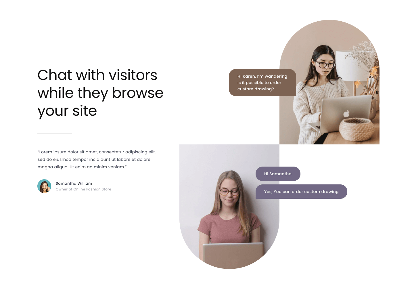
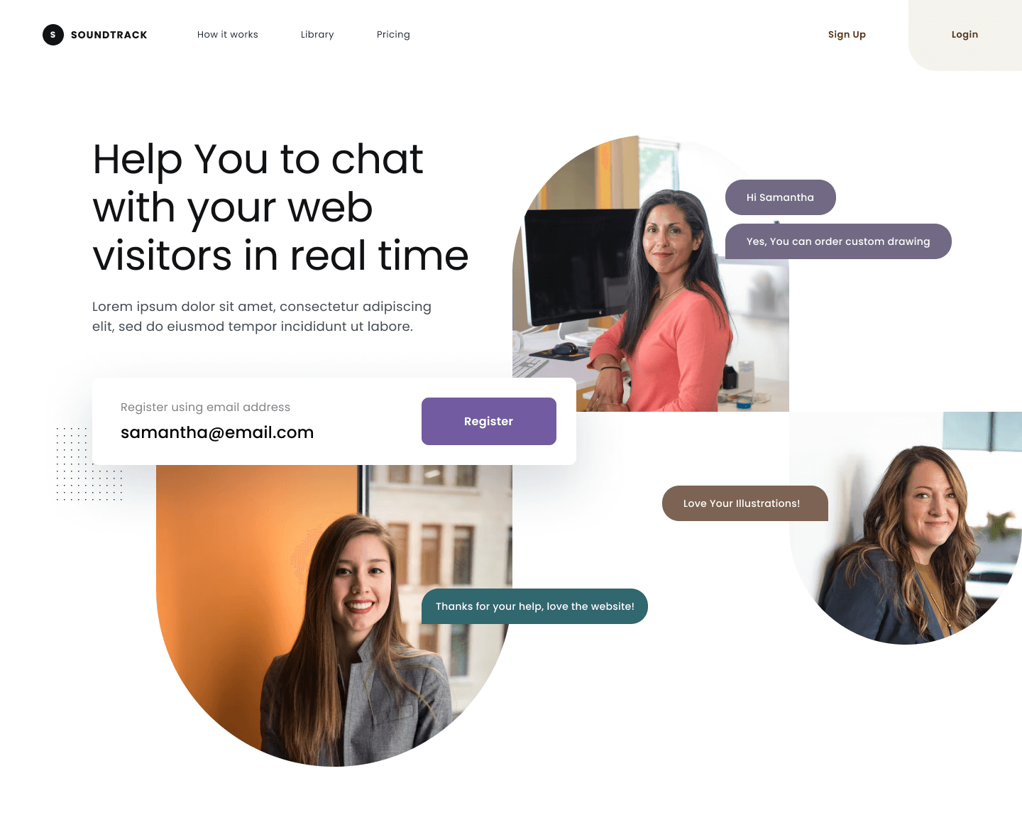
Choose an image that have same context with what you are telling about. When you write about digital product then
choose image that have a person using laptop or mobile phone.
Remember, the function of an image is to emphasize messages. Giving clear context and clear message to the user.
On design above the images emphasize the message "Chat with customers" since all the activity in the images is chatting using laptop and mobile phone. The images feel connected, it looks like they chat each other.
Same context with the message make user easy to understand the main messages.
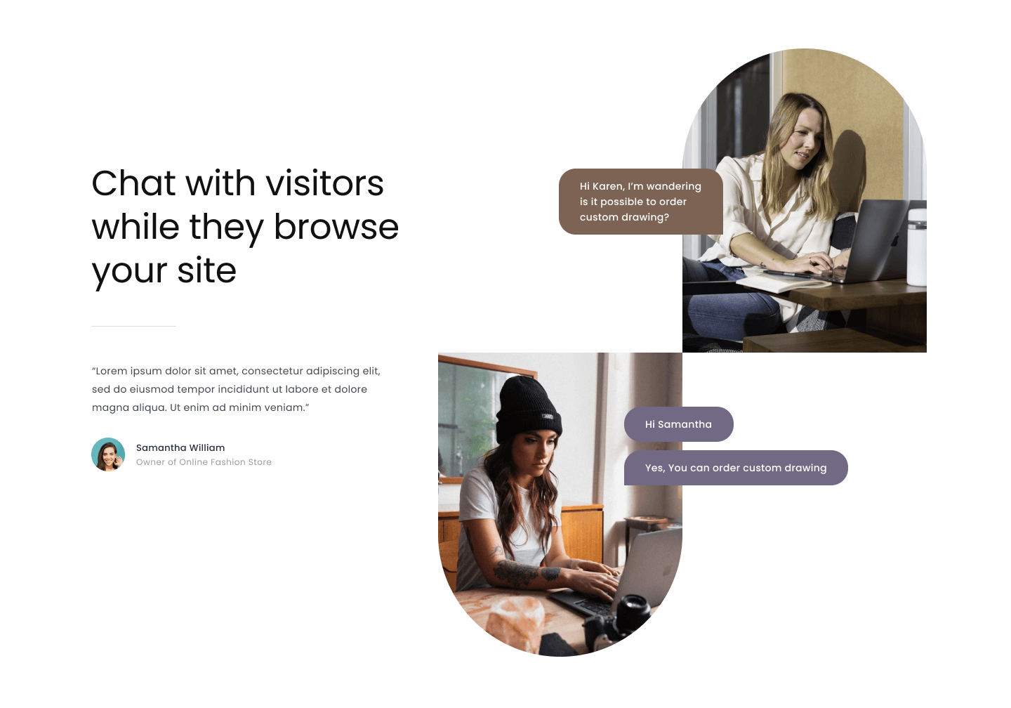
On design above the images have different context with the message. It would make the user confuse, how about you? are you feeling confuse after see the design above?
It looks like the image talk to us.
