References
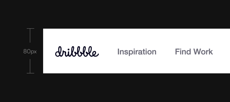
Dribbble
Dribbble using 80px for the navigation area. For the text or link inside it they use 14px.
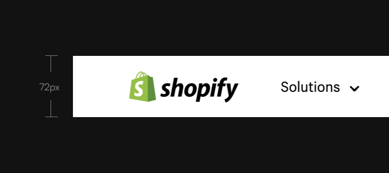
Shopify
Shopify using 72px for the navigation area. For the text or link inside it they use 16px.
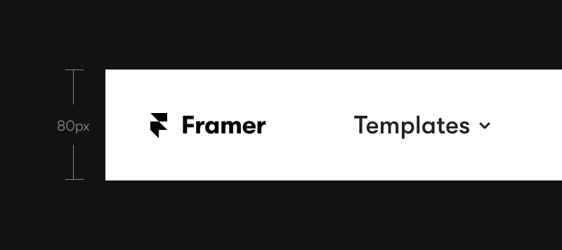
Framer
Framer using 80px for the navigation area. For the text or link inside it they use 18px.
Intercom
Intercom using 106px for the navigation area. For the text or link inside it they use 16px. But when i checked the css, some elements using rem unit, so the size will be depend on your screen size.

My Navigation
The Area
My favorit size for the navigation area is between 80px - 100px. Not too big but still have enough room for playing with font size variations and whitespace.
The Text
For text, my favorite size is 14px for lowercase and 12px for uppercase. In my opinion, text inside navigation no need to big, as long it's easy to read. Big text on navigation area can cause distraction and take some space


Tips
No need to super big
Main function of the navigation is to help user to see menus they can access.
Using proper size for the navigation area as long the link or text inside it easy enough to read and have some whitespace is perfect for me.
Using super big navigation area, with so many whitespace and big text or link inside it is a big no for me, since it would be takeaway some space. Better to allocate that space for more important things or content.
Using super big navigation area, with so many whitespace and big text or link inside it is a big no for me, since it would be takeaway some space. Better to allocate that space for more important things or content.
